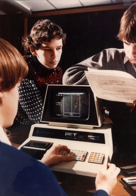
If technology makes you think of teenagers hunched over their smartphones furiously swiping their thumbs across the screen to rearrange an endless stream of brightly coloured 'candies', then you might be missing the point.
The UN predict that 22% of the world’s population will be aged over 60 by 2050, doubling from 11% today. Today’s technology tends to be designed by younger people, for younger people. But as we rapidly approach a point where more than one in five consumers are in later life, surely it is time that tech companies and designers wake up to the needs to this untapped and underserved segment.

Older adults and device choice
Understanding device choice among older adults is a starting point for improving inclusive design. Research shows that older people are more likely to choose a tablet to access the internet, email and apps, even above more established hardware like laptops.
In fact, the latest figures in the UK show 17% of over 65s have a tablet, compared to a national average of 11%. In the past few years, the price and range of tablets available has made them accessible, and their touchscreen technology is often easier and more intuitive to learn and control than a keyboard and mouse. Despite a natural and gradual decline in hand-eye coordination, research has found that the ‘finger tapping’ motion required to operate touchscreen technology is not affected by ageing until much later than other physical functions.
Designers can help older users by considering the spacing and position of the touch interface in apps, to make sure that buttons are easily operated. With this sort of manual dexterity remaining stable up to around the age of 70, app design needs to simply follow best practise for each device for apps aimed at the over 70s, with larger spacing (and text) for older users.
Intuitive design for ease of use
A study has shown that older adults are more inclined to get frustrated, blame themselves and even quit if an online task is initially difficult, whereas younger users are used to spending a bit of time bashing buttons before finding what they want. For tech design to reach out to older people, it should be intuitive to use with user testing of design ideas along the way. While younger users of technology might have become blind to some in-built quirks (like Microsoft Office products which require you to hover over the 'start' button in order to turn them off), older adults might expect more rigorous logic.
A quick look at the 'Elders React' series shows the sort of initial struggle older people have when interacting with new devices, with many users unsure how to access features and navigate the Apple Watch when given one. This US-produced YouTube series of short videos about older people reacting to everything from pop music to technology should be compulsory viewing for designers of tech products.
But it's not all bad news for designers. The same research that saw older adults getting quickly frustrated with their technology did also show that older adults, once familiar with an app or device, are more likely to stick with it and become absorbed. While average tech users have – both hilariously and terrifyingly – been found to have attention spans lower than your pet goldfish, older users fare much better when it comes to concentration — another fact that can be put to good use by tech designers.
Understanding design for ageing
Our vision tends to diminish as we age, and age-related macular degeneration (from which vision becomes gradually blurred) affects half a million in the UK. Websites and apps that use fixed font sizes should avoid using very small text (under 16 pixels) to account for this; even better is to include features to allow users to adjust font size to their needs. Apps like Silver Surf, which makes it easy to increase text size, have already spotted this user need.
Perception of colour, and particularly contrast, can also diminish over time, with shades of blue being most affected. Designers should avoid blue and pay attention to contrast, especially with interface elements which users need to be able to see clearly.
A further consideration for designers looking to produce inclusive products is not physical, but psychological. Older users need to understand more about the end purpose of a product to find it attractive. The 'Elders React' series gives good examples of this, with older people being immediately captivated by cutting-edge technology such as Oculus Rift's virtual reality device. However, they were also quick to identify the disadvantages of the tech they encountered, from the Oculus Rift discouraging and damaging relationships to the Apple Phone impinging on privacy and causing security worries. Designers of tech hardware and applications would benefit from stepping into the shoes of their older users to see and address these potential concerns.
With internet access among the UK's over 65s up at 42% in 2014 and huge numbers of older people getting more active online, designers are starting to produce more tech hardware and apps that appeal to and have added value for older users.
At Sentab, customer focused design is at the heart of what we do. Our hypothesis is that some older adults would be more inclined to use a known device like their TV to tap into smart technologies, and connect with friends and family even if they do not use devices like tablets and smartphones right now. We have taken on board the needs of older users to turn their TV into an interactive, large screen connectivity device, allowing them to talk to friends, share and connect with no new gadget to learn or charge. Our interface is easy and intuitive to navigate, and we offer a comprehensive support service if customers need a helping hand along the way.